I’m still busy creating a new look for this blog.
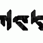
But I’ve finished my logo (well at least the shape of it)
![[mck] logo version 2](http://www.matthijskamstra.nl/blog/wp-content/uploads/mck_logo_v02.gif)
And if you compare it with my previous post you will see that there isn’t al lot of change in the design.
As I said before: I wasn’t satisfied with the “m”. And all it took to change that was a little triangle…
Categories


One reply on “Logo design [mck]”
ik vinnum zonder outline mooier Matthijs.