I wanted to write about this for a long time (about a year now). A list of good, free graffiti fonts.
But I’m not really into fonts, so it seems out-of-place on this blog.
Recently I needed a good free graffiti font, and saw that there was nobody who had made that list. Well that’s not entirely true, I found one: 12-fantastically-free-graffiti-fonts/ but I don’t agree with this list.
So instead of complaining about lists that other people make, I will start my own.
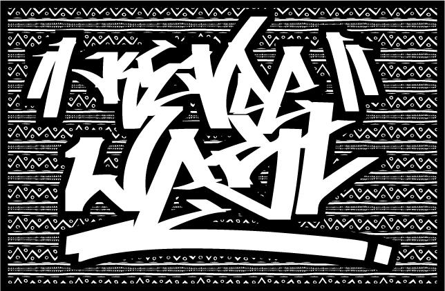
I used dafont to find the font used here, because every free font ends up there.
When I see designers using a graffiti font, they tend to use: Aaaiight!/Aaaight! fat, 5cent or Bring tha noize. Although they are nice, there are better graffiti fonts.
As every list is a personal reflection of the list-makers own taste and this list is made with stuff I like.
I like the condensed, tightly spaced, big marker tags and that’s what I like in the fonts. But I’m also a designer and it’s difficult to explain to your boss, that the font is “dope” but nobody can read the message. So I also looked at lower case, upper case, if it’s more a headline font or a body font, if it’s readable, the fonts has numbers, special characters, and that is use with a very scientific method to come to this list (my guts).
But I must say, I understand why nobody ever made this list… there are not a lot of good, complete fonts out there. Probably because good graffiti artists don’t go sit down and create a font for us, they are out there creating art! To everybody on this list (and not on this list), thanks for the free fonts and the time spend on making the font.
My list is cut up in two parts:
- tag fonts
- piece fonts
Tag fonts
A “tag” is the most basic writing of an artist’s name in either spray paint or marker. A graffiti writer’s tag is his or her personalized signature.
source Wikipedia
#7. Hardkaze
Hardkaze by Pizzadude
http://www.dafont.com/hardkaze.font

- Only Upper case. Special characters. Number
- Readable from font size 18, good for body text and headers
[mck] This is the font that graphic designer should have chosen if he didn’t know better. It’s close to a normal handwriting and I get a “comic” vibe of it. It’s not graffiti enough, but better than the previous fonts.
#6. Vandalism
Vandalism by Julien Saurin
http://www.dafont.com/vandalism.font

- Only upper case. Special characters
- Number
- Readable from font size 24, the bigger the better readable
- headline fon
[mck] Really awesome font, but this one is probably not readable for “normal” viewer. But it’s freaking awesome!.
#5. Searfont
Searfont by bartolD & Sear
http://www.dafont.com/searfont.font

- Only upper case.
- Special characters
- Number
- Readable from font size 36, the bigger the better readable
- headline font
[mck] Really awesome font, but this one is probably not readable for “normal” viewer. But it’s freaking awesome!.
#4. Whoa!
Whoa! by Johan Waldenstr�m
http://www.dafont.com/whoa.font

- Only upper case.
- Limited special characters (!*?).
- No Number
- Readable from font size 18, the bigger the better readable, headline font
[mck] Wow!
#3. Tagster
Tagster by SDFonts
http://www.dafont.com/tagster.font

- Only upper case.
- Limited special characters (!*?;:”‘)
- No Number
- Readable from font size 24, the bigger the better readable
- headline font
[mck] Could easily have been number 2, but it’s not complete.
#2. IllegalEdding
Illegal Edding by Maurice van de Stouwe
http://www.dafont.com/illegal-edding.font

- Only upper case. Special characters
- Number
- Readable from font size 18, good for body text and header
[mck] And from now a graphic designer should use this font. Love this one! And it has a complete font set
#1. PhillySans
Philly Sans by Kosal Sen
http://www.dafont.com/philly-sans.font

- Write in lower case, but the effect is uppercase (no upper case, lower is upper case)
- No Numbers
- no special character
- Readable from font size 18, good for body text and header
[mck] Very clean, readable, and still it has a graffiti vibe. It shouldn’t have been number 1 because it has a very limited character set, but I love this font.
Piece fonts
A “piece” is a more elaborate representation of the artist’s name, incorporating more stylized “block” or “bubble” letters, using three or more colors. This of course is done at the expense of timeliness and increases the likelihood of the artist getting caught.
…..
These pieces are often harder to read by non-graffiti artists as the letters merge into one another in an often undecipherable manner.
source wikipedia
If you need to make a piece in a design, you can also use the tag fonts, but never the other way around!
#6. Throw-up Font
Throw-up Font by Graffilia Fet�n
http://www.dafont.com/throw-up-font.font

- Only upper case
- No special characters (except !)
- No Number
- Readable from font size 36, the bigger the better readable
- headline font
[mck] This list wouldn’t be complete if we didn’t have a throw-up font. I’m having trouble reading it.:(
#5. Cancontrol
Cancontrol by Johan Waldenstr�m
http://www.dafont.com/dht.font

- Only upper case.
- No special characters (except !).
- No Number
- Readable from font size 36, the bigger the better readable
- headline font
[mck] Nice one
#4. Aerosol
Aerosol by Bright Ideas
http://www.dafont.com/aerosol.font

- Only upper case
- Special characters
- Number
- Readable from font size 24, the bigger the better readable
- headline font
[mck] This font is made to color in. Not my style, but very nice!
#3. Homeboy
Homeboy by Johan Waldenstr�m
http://www.dafont.com/homeboy.font

- Only upper case
- No special characters (except !).
- No Number
- Readable from font size 36, the bigger the better readable
- headline font
[mck] Nice one
#2. Zit Graffiti
Zit Graffiti by Olivier “Zitoune” D.
http://www.dafont.com/zit-graffiti.font

- Only upper case (there is a difference between upper and lower case: upper case is an outline character).
- Limited special characters (!)
- No Number
- Readable from font size 24, the bigger the better readable
- headline fon
[mck] A oldskool graffiti font. Nice
#1. Bboy
B-Boy by Johan Waldenstr�m
http://www.dafont.com/bboy.font

- Only upper case.
- Limited special characters (!).
- No Number
- Readable from font size 24, the bigger the better readable
- headline font
[mck] A very oldskool graffiti font, I like this one very much.
Update #1: I just read this post about
44 Free Stylish Graffiti Fonts for Designers on NaldzGraphics. It’s a big list of free graffiti fonts: the same comments that I mentioned earlier goes for this list: it a list with all available free graffiti fonts out there…


